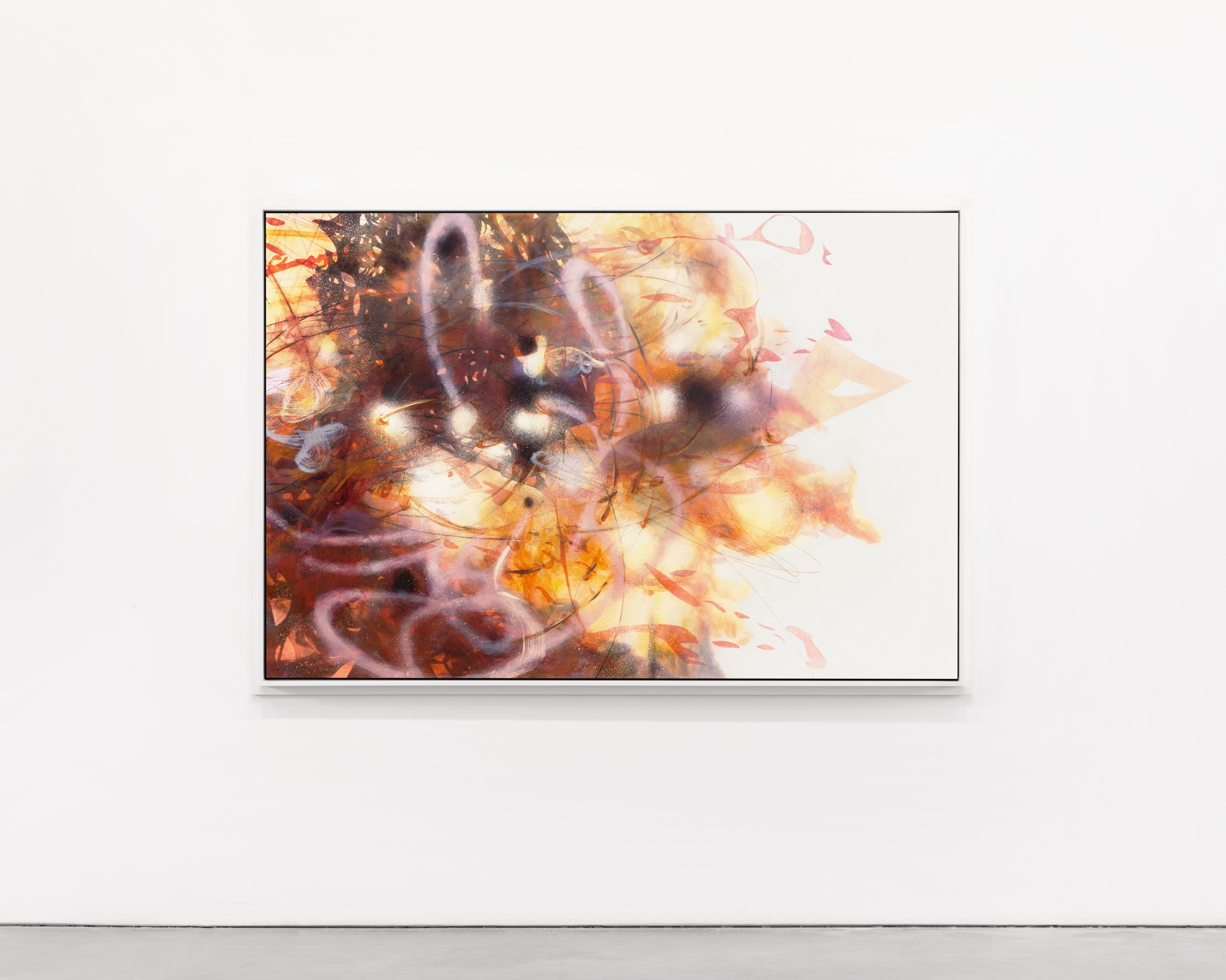
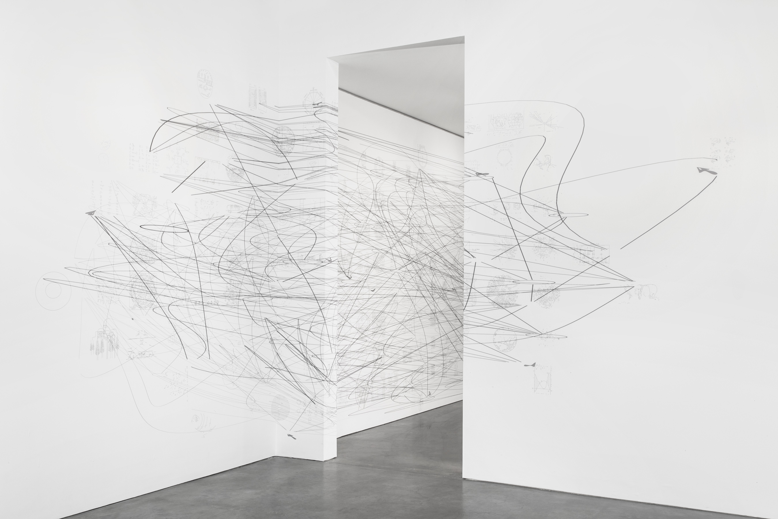
Night Drawing, 2014. Powder coated aluminum. © Matthew Ritchie, Courtesy Andrea Rosen Gallery, New York. Photos by Lance Brewer.
Is information always informative? If ideas and interpretations often take the form of charts, sketches, and drawings, do diagrams also represent understanding and feeling? Free of context, can data become beautiful? For Ten Possible Links, his fifth solo-show at Andrea Rosen Gallery, artist Matthew Ritchie explores these questions and more, reflecting on the ephemeral nature of information through a series of paintings, moving images, sculptures and sounds.
Videos by VICE
At the showcase, on display through October 22, viewers can experience four of Ritchie’s unique works: a room of layered paintings also known as Ten Possible Links, The Temptation of the Diagram, a collection of diagrams stripped of legibility and translated into gestures, Night Drawing, a looping, intricate sculpture and 3D drawing created in collaboration with architects Aranda\Lasch (watch The Creators Project’s documentary on Aranda\Lasch here), and Monstrance, a film set to a score by Bryce Dessner.

Our promised rising, 2014. Oil and ink on canvas.
The Creators Project spoke to Ritchie about his multilayered works, the reasons why he’s fascinated with diagrams, and how his pieces evolved from idea to conception:
The Creators Project: Can you explain the relationship between your work and diagrammatic thinking? How did you become involved with it?
Matthew Ritchie: My work has always included diagrams as a way of gesturing both towards and away from my totalizing impulses, but I’ve never considered them as distinct from drawing. I found that diagrams are still largely unprocessed and unacknowledged by conventional histories of art and science while at the Getty Research Institute as an artist-in-residence in 2012. The diagram is not only the most basic form of drawing, but also the skeleton key of the modern world. I felt compelled to explore the history and relations of human diagrams in depth.

Where does the “information” in your work come from?
Everywhere. It’s hard to keep it out.
Why did you name your paintings Ten Possible Links?
The title is from a diagram in Graham Harman’s book, The Quadruple Object. For Harman, the ten possible links are the ten types of primary connections between basic categories of meaning. For me, it provoked the production of ten possible paintings and stimulated me to think about connections and force relations in general.

Objects and realism, 2014. Oil and ink on canvas.
The transformation of information into abstract forms reminds me a lot of the immense yet difficult to decipher aesthetics of Big Data. Can you explain the relationships between your work and Big Data?
One of the battle cries of the early information age was “information wants to be free,” and I’ve always been curious of what it might look like if it was truly emancipated. Unfortunately, we seem to have accepted our information will be imprisoned instead. I’m much more interested in the extent to which the human gesture inflects connections with meaning and intent. Computers cannot really “see” the data they present and nor can we. Those visualizations neutralize information, no matter how beautiful they seem. A painting is a singular event, its data horizon (if that is even a meaningful term for painting) and effect is re-created in real time each time by anyone who looks at it.

Home is the hangman, 2014. Oil and ink on canvas.
What was the process like for creating Night Drawing?
Building on the fantastic work of Sarah Sze and Tomás Saraceno, I wondered if I could develop an expressive spatial drawing that does not rely on an external support system, but provides its own self-supporting internal structure through a progression of developable surfaces. I decided to use Lorenz attractors as an initial condition, and the chaotic loops became an amazing substrate for a series of drawings derived from the Temptation of the Diagram project. The process was far more complex and rewarding than we had imagined, and the project gradually iterated into seven very distinct sculptures, the first being Night Drawing.

Is your assertion in “Superposition and Field” [forthcoming in a book of essays from MIT Press], that “‘form’ and ‘content’ are the same thing, namely information,” the reason why you elected to use the medium of video for Monstrance?
The idea that form and content is the same thing derives from information theory. Everything can be understood as a form of information but in the end, it’s the signal-to-noise ratio that really counts. In Monstrance, a number of content platforms such as paintings, wallpaper, books, songs, QR codes, texts and video are subtly repurposed to blur the distinctions between form and content. The song in the film loops polyphonically, as the singer physically loops through a series of choreographed gestures and repeats a short series of lyrics that collapses Paradise Lost into two sentences.
Monstrance, 2014. Single-channel video installation.The film is a composite of digital footage and live footage; we filmed at sunset in a single take when visible light was rapidly degrading and then de-saturated and reprocessed [the film] to have the resolution and frame rate of an early television signal. The picture ratio was cropped to a square, removing 30% of the image. Although the film is visually very rich, it is highly compressed, and the editor Nick Roth and I removed almost as much as was put in. At a certain point, the formal decisions completely transform how we interpret the content of the image.

The Temptation of the Diagram, 2014. Printed phototex.
So, what’s next?
I’m completing a 27,000 square foot molecular roof garden for the Food and Drug Administration that will become a performative ecosystem. An evolutionary timeline of plants will steadily compete to fill a geometric sculpture court, producing a kind of visual balance between chance and order.

Catch Matthew Ritchie’s Ten Possible Links at Andrea Rosen Gallery, through October 22.
Related:
Meet The Artist Who Launched The First Kickstarter-Powered Art Exhibition
Fever Dreams, Birds, And Butterflies Converge In New London Exhibition


