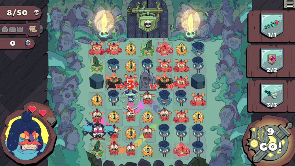
The thing about a game where you match colors is that the color part is usually pretty important. Grindstone, one of my favorite games from 2019 and a game that regularly caused me to ignore my children, dresses up the occasion with a gorgeously violent cartoon aesthetic, but ultimately, the player’s tasked with matching colors in the ideal order to win.
And yet, starting today, the game includes a new mode to try and address this, because nearly two years after release, the developers decided to challenge their own assumptions.
Videos by VICE
“How do we even address an accessibility issue so ingrained into the game’s core?” said Capy Games lead narrative designer Kaitlin Tremblay to Waypoint recently. “And then, on top of that, how do we address this issue a year after the game’s already been out and core mechanics and structures have already been established and shipped?”
What appears in the game now is called a “high-contrast mode,” in which the screen darkens when the player selects an enemy (a “creep”) intended to be the start of a matching chain. Upon darkening, the game only highlights other enemies with the same color/shape, meaning players are no longer tasked with differentiating based solely on color and design.
The mode also includes two different levels of contrast that can be quickly toggled on and off, because one wrinkle the team ran into was that hiding too much could also prevent players from fully internalizing the rest of the game board, leading them to make mistakes.
Garret Voorhees, a designer with colorblindness, wrote that tweet. Voorhees has what’s called the deuteranopia variant, which, in his words, “means that red/green and blue/purple are often really tough to differentiate, especially if their value (lightness/darkness) is very similar.”
“My colorblindness is mild to moderate,” he said, “so I rarely encounter a game that I’m completely unable to play. However, it might take me longer to differentiate between two similar (to my eyes) colors, which can mean the difference between success or failure in some games.”
Grindstone was a comfort game during COVID-19 for Voorhees, and his colorblindness slowed him down. It didn’t make Grindstone unplayable, but it made it harder. Puzzle games are a particular issue. The beloved Super Puzzle Fighter II Turbo, for example, one game Voorhees cannot play at all, because the shapes are too similar in shape and color and the game’s speed is so demanding that he eventually threw up his arms and stopped trying.
Voorhees approved of Grindstone‘s solution because “focusing your attention on what’s eligible, and deemphasizing what’s not, seems to fit well into the game’s flow.”
Accessibility, like any other aspect of game design, is easier when it’s given consideration early in development. The longer you wait, the more work it becomes to adjust other parts of the game to accommodate. The industry has made important strides in this regard—this game about spiders including an arachnophobia mode, for one—but there’s always room for improvement, even for games that have already been released. Of course, “released” is a funny word lately, given how many games, Grindstone included, are continually updated.

“Live games are great because they do afford these opportunities to address things that couldn’t get addressed at launch,” said Tremblay. “I think we definitely felt a bit like we weren’t sure if we could improve Grindstone beyond initial design considerations for color-vision deficiency players, but we feel like we did in some capacity, and that in and of itself is a huge lesson.”
Capy Games programmer Ken Yeung first toyed with what would become the high-contrast mode in-between other updates, as part of several prototypes to address the problem. One goal, Yeung said, was to make the accessibility feature fit “into the look and feel of the game.” One of the prototypes is very similar to what shipped, and the feature has proven so popular within Capy Games that it’s become many folks’ preferred way to play the game.
The notion of accessibility features being embraced by wider audiences is extremely common. Just think about how often you flip on captions without considering their origins!
“There are design, art, and programming learnings we all have now as a team that we can carry forward in our future games to hopefully keep making our games more and more accessible,” said Tremblay.
Follow Patrick on Twitter. His email is patrick.klepek@vice.com, and available privately on Signal (224-707-1561).


