We’re not going to lie: we haven’t gone running in a long time. We like to do some gentle lifting, but can’t totally relate to our friends who need a post-work jog to clear their heads. It’s beyond foul out, and we know a few of them who would kill to run without the risk of drowning in a pile of cigarrette-stained slush. While a treadmill may get them their fix, visual statistic site, Flowing Data, has shared a series of images called “Where People Run” that will make you feel more connected to kindred joggers across the country.
Created by PhD, Dr. Nathan Yau, an expert at exploring personal data collections in a visually stimulating way, “Where People Run” is a meditation in connected routes and paths. Whereas personalized exercise apps show our individual running routines and statistics, Yau thought it would be more interesting to combine publically shared workout data through apps like RunKeeper and Strava.
Videos by VICE
The aggregated information makes cities like New York, Boston, Paris and more appear like animated beings with purple veins surging from that cardio-induced endorphin rush, similar to other projects that have used big data for creative applications. Take a look at some of his maps and get that second-hand runner’s high.
New York City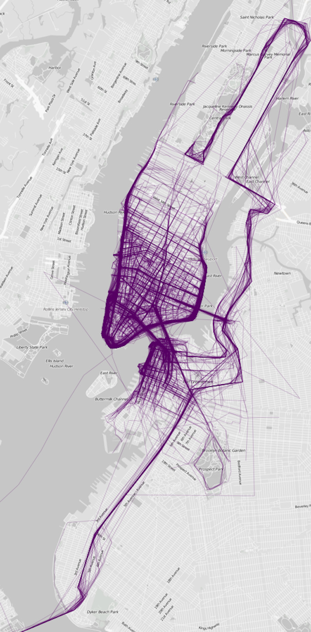
London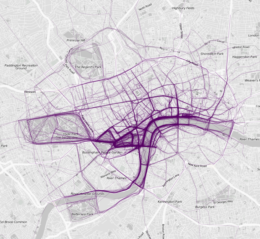
Chicago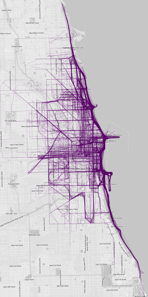
Philadelphia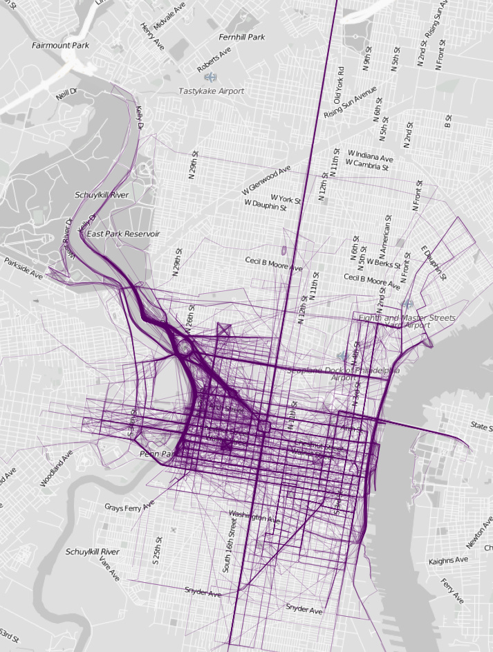
Paris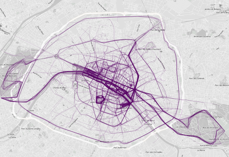
Images via Flowing Data

