Cyberpunk 2077 is not a pretty game. Some of that is intentional: the world of Cyberpunk is one of ruin and decay, masked by a cloying glaze of advertising and chic corporate architecture. But it’s also true that, by and large, there is very little in Cyberpunk that ever looks cool or beautiful. Your outfits are generally terrible, and so are the NPC’s. The world is large, but rarely so large that it ever feels expansive. Most places you go feel like the place you just left, and even if you light out of the wasteland around Night City, you’ll find a familiar Fallout-style collection of scrap heaps and scrub desert. No matter what you are running Cyberpunk 2077 on, no settings tweaks can make it stylish.
However, Cyberpunk 2077 is also not quite as ugly and grating as it first appears. And the major culprits are the visual effects options the game turns on by default: film grain, chromatic aberration, depth of field, lens flare, and motion blur.
Videos by VICE
Some years ago, a lot of games were heavily over-doing these effects and disabling them was an easy way to make a game look better and clearer. Most games I’ve played in the last few years, if they still use these settings, have gotten a bit more restrained with them and I rarely feel moved to mess with them anymore. But Cyberpunk 2077 is a throwback to the late 2000s and early 2010s when tons of games were shellacking the picture with after-effects to give games more cinematic looks.

Except these aren’t really cinematic looks, they’re effects meant to evoke the camera distortions you get with faulty equipment or bad technique. It’s JJ Abrams’ Star Trek with lens-flare, except Cyberpunk 2077 also has several other eye-catching effects firing all at once, and all at the same intensity. With all these effects turned on, it’s like you’ve traveled to Night City only to look at it through the screen on the back of a twenty year-old digital camcorder with a cheap lens. To me, that’s a wasted trip.
First, the film grain effect doesn’t look so much like film grain nor like its static-y digital equivalent. To my eyes, it looks much more like the “screen-door” effect of early, low-res VR. As if you’re looking at a high-res image through a slightly lower-res filter. Turn that shit off.
Second, while the depth of field effect was pretty subtle, it also never looked convincing to me. With the effect turned on, I never saw the kind of softening I’d expect with a realistic depth of field effect. Things might have looked very slightly muddy in places, but it didn’t produce any sense of depth or focus. I decided just to leave it off.

Third, lens flare was just too much and often registered more as glare than flare. There were some scenes were the effect worked well, producing striking little crescents around harsh light sources, but mostly it washed out a lot of detail and erased more interesting lighting effects.
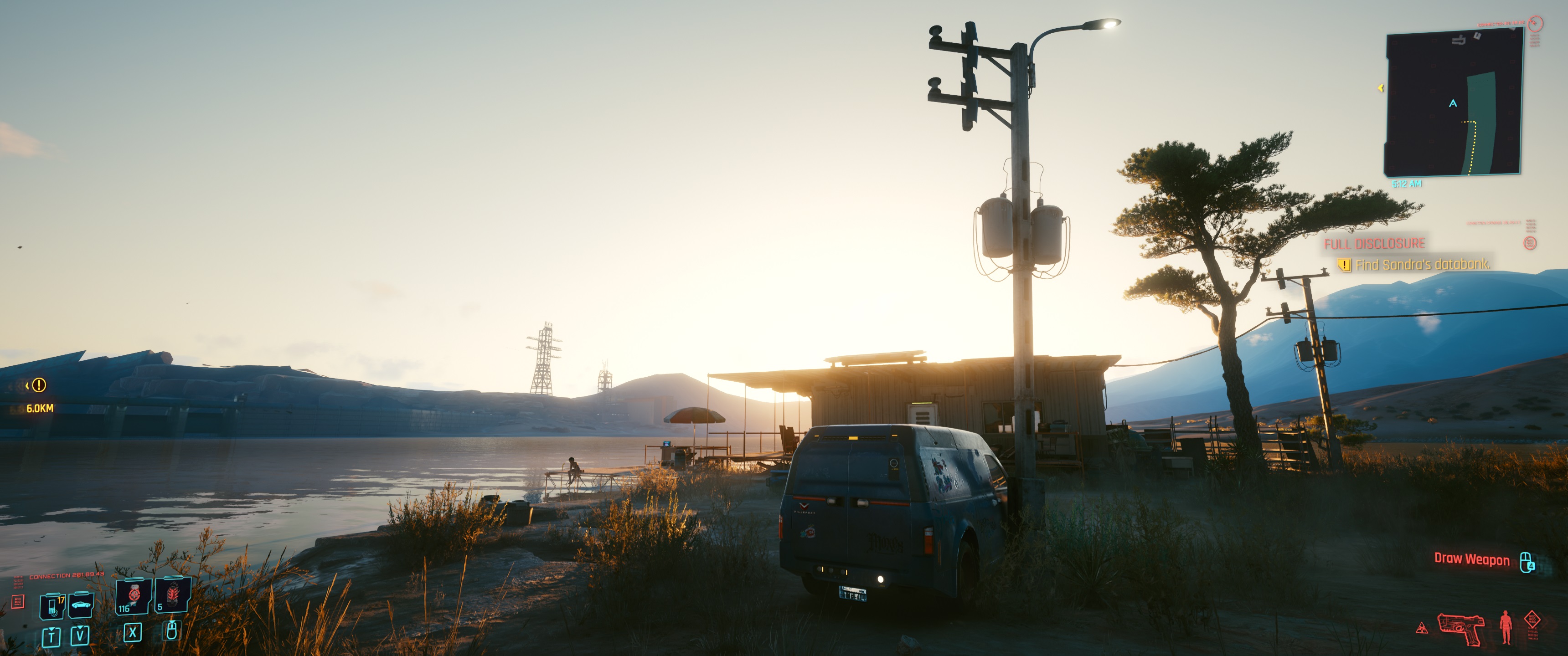
Check out the above photo I took by a lakeside cabin at dawn, with no effects. The cabin is backlit by the rising sun, but the sun is still well below the roofline. The top image looks about like what I’d expect to see both in-person and with a decent camera: the light is breaking across the top of the cabin and you can see the harsh sunlight framing the backlit house and obscuring the backdrop where it’s most intense. All about right.
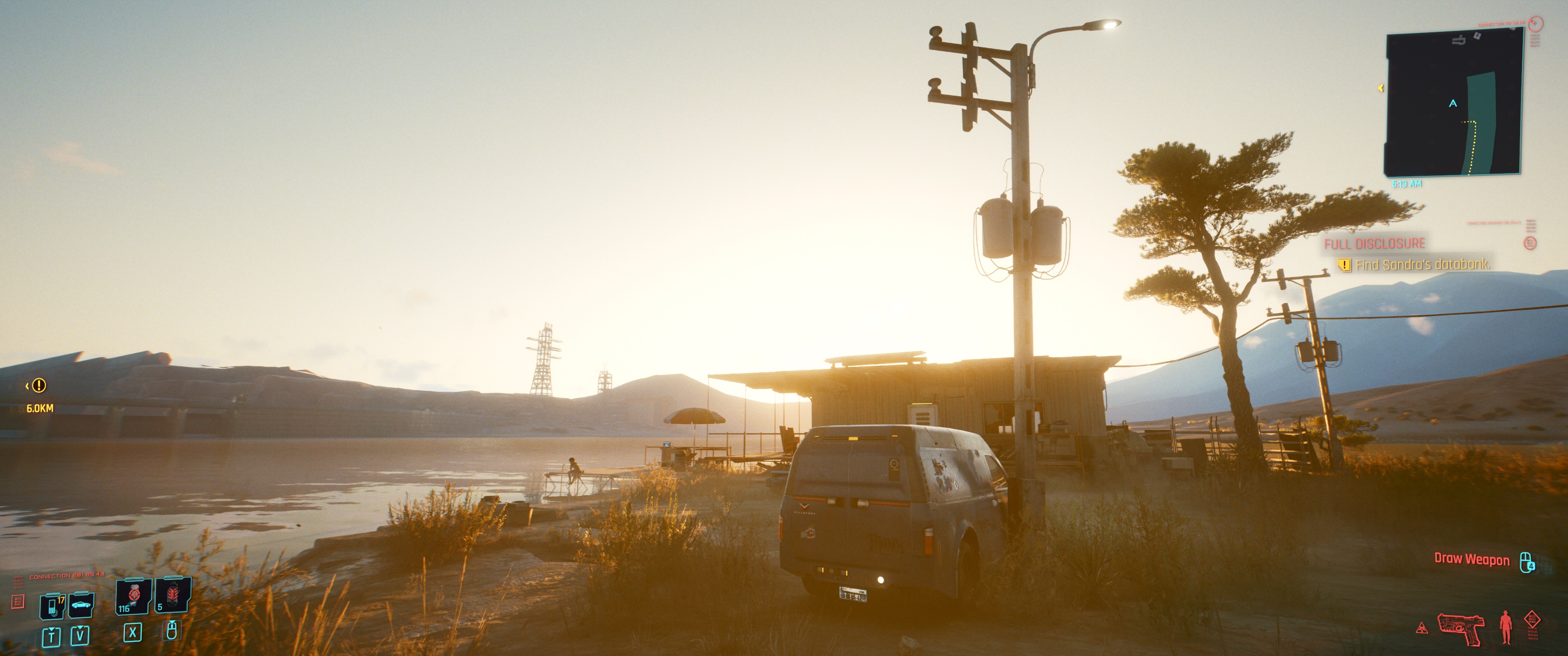
The second photo, with only lens flare turned on, just gets the scene wrong. The entire frame is washed in gold sunlight… except there is no direct sunlight that we’re exposed to. We’re well within the shade of this house, but the effect makes it look as if we’re looking directly at the sun from inside a jar of urine.

Still, chromatic aberration was the nightmare effect, and I think it might have been worse because I was playing on a widescreen monitor. It’s where an image displays color-shifts along object borders, and it mimics an effect you get with flawed lenses. In Cyberpunk 2077 the intensity of this effect increases as you look from the center of the screen to the edges, and on my widescreen probably a third of the entire screen displayed both thick distorted lines of “purple fringe” and blurring.
I totally get that these effects are valid aesthetic choices, and you would never hear me arguing that digital noise or chromatic aberration were bad calls in games like ZombiU or Kane and Lynch 2. Both were trying to evoke very specific media and call attention to the way players’ view of the action was mediated along with our relationship to it. But Cyberpunk 2077 is already a game loaded with bold lighting and effects that already create an oppressive and alienating atmosphere. Its default visual settings just take those and slap a bunch of bad filters onto it.


