Images courtesy of the artist
In the past, we’d find mythological figures gracing the ceilings baroque palaces. These days, however, abstract shapes, culled from data visualizations, have taken their place:
Videos by VICE
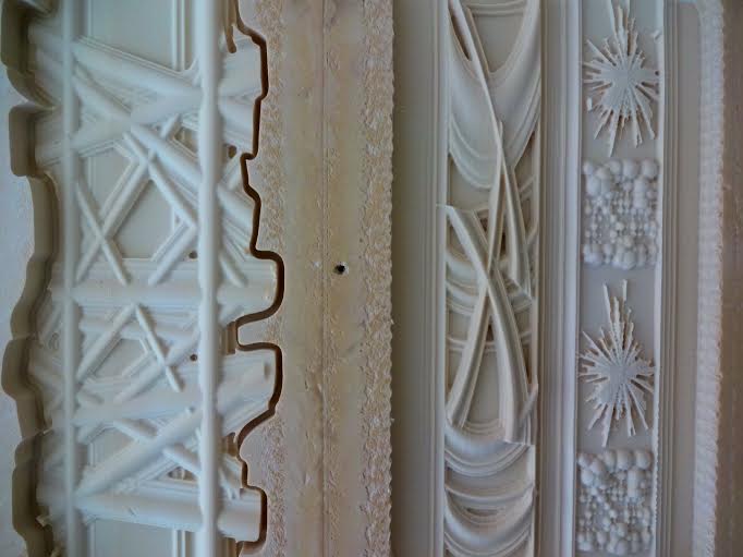
Glasgow-based multimedia artist Calum Stirling recently installed an unlikely ceiling installation in Edinburgh. On view until August 30th as part of the alt+w program, this update of traditional Scottish cornicing, or decorative molding, is loaded with social, political and economic data. From wind energy statistics to those of income inequality, Stirling’s figures are molded from wall insulation foam, and carved out by an artist-built CNC milling machine.

Meant to distort traditional indications of wealth and status, Stirling first got into cornicing when he gazed upon the old school municipal buildings and homes in Scotland, many with their original ceiling decorations still intact. “I just began to think one day about how weird, but how present this stuff was,” said Stirling, “and yet how out-dated the aesthetic of its language is to modern tastes.”
He finds it funny how little the public knows about the classical symbolism and design, passed down through the Renaissance, then was revived by Scottish neo-classical architects. “A history right above our heads,” he explains.

Since building the CNC milling machine, he filled it with statistics sourced from a variety of sources, including numbers from the Scottish government’s website, and even university psychology departments. A collection of stats that range from economics to sociology, the project raised questions regarding “the ephemeral and malleable nature of data,” said Stirling.


The building process was a bit of an overnight surprise: “Sort of amazing to go to the workshop and set up a new block of material, load the files and go home, leaving it to cut away on its own overnight,” claims Sterling. Looking a bit like coral reef in some places, and fireworks in others, the abstract aesthetic of the ceiling piece presents itself in 10 basic format types. Ranging, “From the simplest linear bar graph and extrusion type form, to the more complex polar plot and scatter cloud,” Stirling even includes some of the mistake boards, from when the machine started skipping its cut instructions. “I left some of those details in the final ceiling design too,” he says.

Data sets included in the ceiling piece display wind energy and distribution for turbines near Brora, and plastic surgery procedure indexes for men and women. We even see cheeky statistics, like the predictions of increased unethical behavior amongst higher socioeconomic classes.
The center of the masterpiece, which looks like a Scottish cake, is an automobile statistic around averaged 4×4 car deprecations: “Cake decoration is a designed to draw you in using repeat circular patterns and motifs,” said Stirling, who has never worked with repeat designs before this. “Using the techniques of mirroring, incremental scaling and formal layout, it’s been a very curious process.”
Already at work on his next project, Sterling concludes to The Creators Project, “I’ve been thinking a lot recently about the reinvention of the 1970’s concrete new town mural and developing a live carving machine to do guerrilla architectural interventions.”


The alt-w exhibition runs until August 30 at the Evolution House, 78 West Port, Edinburgh. For more, check out Calum Stirling’s website.
Related:
Error-Ridden Data Visualizations Become Beautiful Accidental Art
The YouTube Of Data Viz Feeds You The Web’s Best Infographics


