Spanish graphic designers Gonzalo Hergueta & MRKA follow the evolution of typography and digital communication in their new documentary film, 83M80 – Letterpress In The Digital Era. The self-initiated project resulted in a 10-part series of moveable typeface styles that act as a historical timeline of visual communication and the technologies responsible for it. The filmmakers interview a graphic designer, graffiti artist, and a letterpress extraordinaire as they trace the development of design and typeface, as influenced by errors, misconceptions, and the visual tendencies generated from developing technologies.
In their interview with Alex Trouchut, the graphic designer and illustrator discusses the impact technology has had on his artwork, and the control it creates over his final product. “In a way you are making things that are like really kind of artificial in a way because you don’t embrace the error. and the error is part of the beauty of many things,” he tells the filmmakers.
Videos by VICE
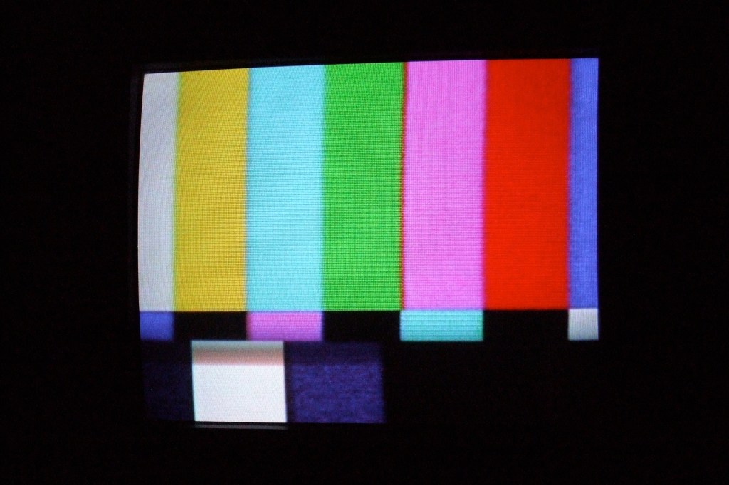
The film’s interview with digital product designer Shay Moradi reflects on technology and design’s move towards perfection and how, in previous decades, our threshold for imperfection was much higher. Television and film footage from the 70s and 80s have a certain quality that we now label authentic. The level of scrutiny digital products are now under, and consumer culture’s infatuation with malfunction and the glitch, Moradi explains, are pushing technology to absolute perfection. “In a way it’s a form of media archaeology, to be able to preserve the way things are glitching now for future generations to revisit this and try to recreate how we used to communicate in the past.”
This move towards perfection has established an artistic compulsion to humanize technology by making it less perfect. We are not machines, we are not perfect, and implanting that idea into visual art is something new age graffiti artists have been exploring. Felipe Pantone, a.k.a., Pant1, expresses the themes that drew him to graffiti in the first place: “speed, universality, omnipresence,” through computer errors and the internet, “which I think is the best representation of the times we are living,” he tells the filmmakers.
The 83M80 team created their own typeface by experimenting with with the old style serif font, “Bembo,” a font style we see in action when they visit the workshop of professional letterpress printer Earl Kallemeyn, who has been working in the printing industry since the 80s. Last year, the filmmakers put on an exhibition that presented some of the topics discussed in their film, and a compilation of work by digital artist they invited to experiment with their new font.
Find out more about 83M80 – Letterpress In The Digital Era on the film’s website.
Related:
A Graphic Designer Is Preserving Urban Typography
Bringing Trending Topics Back To The Days Of Moveable Type
A Massachusetts Newspaper Is Getting a Daily Dose of Typography


