A version of this post originally appeared on Tedium, a twice-weekly newsletter that hunts for the end of the long tail.
You don’t know Norbert D. Larky and David D. Holmes, but you’ve definitely seen their work thousands of times in your life.
Videos by VICE
It’s the kind of thing that has existed in the brains of people who left the TV on an obscure cable channel in the middle of the night, the kind that doesn’t have 24 hours of content to fill their day.
Or maybe there was a glitch at the station and they needed to fill some airtime. What Larky and Holmes created in the early 1950s was the one of the most iconic test patterns the world has ever seen.
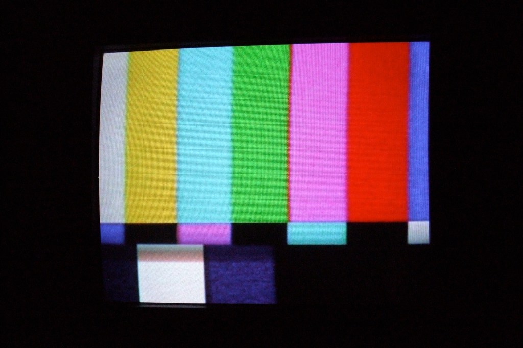
You know the one, with the bright color bars that are hard to miss. It’s probably the most widely recognized, but test patterns like it have been a key element of television almost since the beginning.
Read on to learn how we got them, and what they do.
“A significant on-screen representative and host of the New World of television programming emerging in the 1930s and 1940s, the test pattern entered into an existing world of settler colonial mass media power and control over representations of Indians, in which the culturally and socially multidimensional and fluid indigenous is practically negated and absent.”
— Dustin Tahmahkera, an associate professor with the American Indian Studies program at the University of Illinois, discussing the simplistic and stereotypical nature of the “Indian head” illustration, a drawing of a generic Native American man wearing a headdress, used on early television test patterns in his 2014 book Tribal Television: Viewing Native People in Sitcoms. Tahmahkera, a citizen of the Comanche Nation of Oklahoma who specializes in researching Native American images in media, notes that at the time, it was one of the few mainstream portrayals of Native Americans in popular culture (he calls it “television’s first famous Indian”), and compared the portrayal to the type used on coins immediately before the test pattern came into use.
Sadly, the people credited with inventing the color test pattern haven’t gotten a ton of public recognition for it
Let’s say you’re floating around an obituary page in a newspaper—let’s say the Los Angeles Times—and you see this line crop up:
He earned his engineering and electronics degrees from Lehigh University and his master’s from Princeton University. Dave had a distinguished career with 13 patents to his name, including the color television and the color test pattern.
This guy has a patent for inventing the color TV? And there’s not a reported obituary about his life?
That was an experience that readers of the Times could have had in August of 2018, when an obituary for the 91-year-old Norbert David Larky (who generally went by his middle name) ran in its newspaper.

Clearly, this was a missed opportunity for the L.A. Times, as Larky (along with David D. Holmes) legitimately did receive the first patent for the color test pattern generator, which was granted in 1956 after being filed for in 1951.
The color TV concept does predate Larky, but as an employee of early color television innovator RCA, he did develop some key patents on that front.
To be clear, there is evidence that Larky and Holmes have received the initial patent for this invention, though others were, without realizing it, competing with them around the same time. For example, Charles J. Hirsch of the technology company Hazeltine wrote a lengthy piece for the academic journal Advances in Electronics and Electron Physics in 1953, in which he described that company’s work on color television, including a discussion on the creation of color bars.
These test bars, throughout their evolutions—with the most recent occurring in 2002 to account for the HDTV switch—remain important in the television industry, as they allow engineers to adjust color schemes to correctly match what’s on the screen and modify accordingly.
But, thinking bigger picture, they represent some of the first electronically produced graphics ever displayed on a screen—a pretty significant development in a world where graphics are everywhere. (Graphics, while a fundamental part of computing today, didn’t become mainstream on computers until the 1970s, when terminals transferred from printers to monitors.)

Before those color bars, a wide variety of different black-and-white images were used, most notably the “Indian head” graphic created by RCA in 1938, which became the first popular test image of the era.
Writer John R. Meagher explained in a 1948 Radio Electronics article the necessity of these test patterns at the time. Early televisions needed much more in the way of constant tuning, which meant that guidelines that helped owners test for the curve of the picture, the overall focus, the shading, and for interlacing were necessary.
“There is no standard test pattern in general use. The nearest thing to a standard is the RCA ‘Indian head’ monoscope, which is used by a number of TV stations,” Meagher wrote. “[The Radio Manufacturers Association] has proposed a standard ‘resolution chart,’ but for various reasons it has not been adopted by TV stations for air use.”
During the early television era, this image showed up multiple times a day on some channels, along with an accompanying sine wave tone, which generally blared at a 1kHz frequency. (You’ve assuredly heard this dull blare many times in your life.)
Over time, color bars became even more familiar to TV viewers than the black and white equivalents. (Probably a good thing, as the black-and-white test pattern used a stereotypical image of Native Americans.)
Beyond its technical reasons for existence—initially, it was used for calibration in early color televisions, and is today used as a way to ensure chroma and luminance levels in modern screens of all types—it became a pop culture icon of its own. The mobile game show HQ Trivia, for example, directly riffs on the color bars just before a game starts, integrating a modern twist on a vintage look. And Elliott Smith wrote a song about them.
While the NTSC version is probably the best known, it’s not the only one that large numbers of people recognize. Outside of North America, a highly complex PAL variant developed by the electronics company Philips in the mid-1960s has frequently appeared on television in different parts of the world over the years.
TV pictures eventually became much easier to keep tuned, which meant that the reasoning for the regular use of color bars and other test patterns was less essential on a regular basis, but they became a part of the fabric of modern life, especially on cable channels that didn’t have enough content to fill out an entire day.
Why does the NTSC color bar system look the way it does?
Over the years, the color bar test pattern has evolved multiple times to cover different color schemes, with the basic guideline for NTSC sets managed by the Society of Motion Picture and Television Engineers. As the YouTube video highlights above, the exact sequence of color bars evolved significantly from its first appearance in 1954—in which the bottom bars, a small part of the test sequence today, once took up more than half of the screen.
But even if the general design has evolved and the use case has become a bit more narrow, they remain incredibly common.
The most well-known design for the color bars, set by the Society of Motion Picture and Television Engineers in 1978 and updated in 1990, uses three rows of bars.
The first row, intended to show a basic color field, relies on a general mixture of the three primary colors—red, green, and blue—in different combinations, starting with white (though it is displayed as something of a grayish color in practice), then going to yellow (a combination of red and green), cyan (a combination of green and blue), green, magenta (a combination of red and blue), red, and blue. (Some variants, including the original 1954 specification and the more recent HDTV version, add tones of gray or black.)
On a TV screen, these blocks appear as a row of colors, but if you look at the bars in a waveform monitor, it displays the colors in a stair-step layout to highlight the scale of brightness, with the brightest color on the left and the darkest on the right.

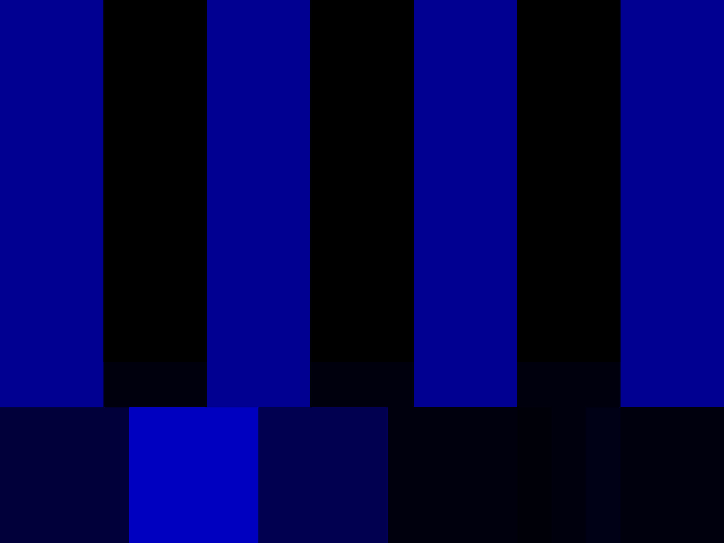
The tiny second row, added in the 1978 edition of the color bars, exists essentially as an alignment system for color that takes personal judgment out of the equation. If you were to display only a blue version of the screen, as much professional equipment does, the middle bars will closely match with the top. The result is that you can measure color hue and saturation quickly and objectively, which comes in handy if, say, you’re working with a lot of video equipment and you need to calibrate it.
The final row (which I’m simplifying a little for sake of not going over people’s heads) contains full-intensity white block and a low-intensity black block. Along with other blocks—a dull purple and blue block that are used to ensure the color signal is being properly demodulated, and a series of short black bars, known as the “pluge pulse,” that help calibrate black levels on the monitor—the bottom row effectively works as something of a utility row to help fine-tune different settings, something shown in the Lynda.com video above.
The result is that you can calibrate screens consistently and perfectly across the board—something that still matters in the world of video production, even if our modern TV sets need it less.
“When we did it, nobody thought it would last for more than a few years, because none of the other test cards had.”
— Carole Hersee, known as the BBC’s “Test Card girl,” discussing how her picture, which appeared within a test card shown during dead periods on the BBC schedule for more than 30 years, making the picture of her—sitting next to a stuffed clown toy, doing a tic-tac-toe puzzle—one of the most common seen on British television. The card, shown between 1967 and 1998, disappeared from air between 1998 and 2009, at which point it returned with BBC’s HD broadcasts to help digital TV owners tune their screens. Hersee, who was 50 at the time of its reappearance, wasn’t necessarily psyched about her childhood photo making a comeback. “I am a bit bemused as I would have thought they would want to modernize it, but if they feel it is suitable to use after all these years, then fine,” she told The Telegraph.

There are test patterns hiding all over Netflix, and they’re more entertaining than some of their shows
These types of test patterns, despite not being useful for most TV owners, have never gone away. In fact, they retain much of their value in professional contexts.
And if you go digging far enough on YouTube, you can find examples of test patterns being used by major networks, some of which differ greatly from the standard styles you’re used to.
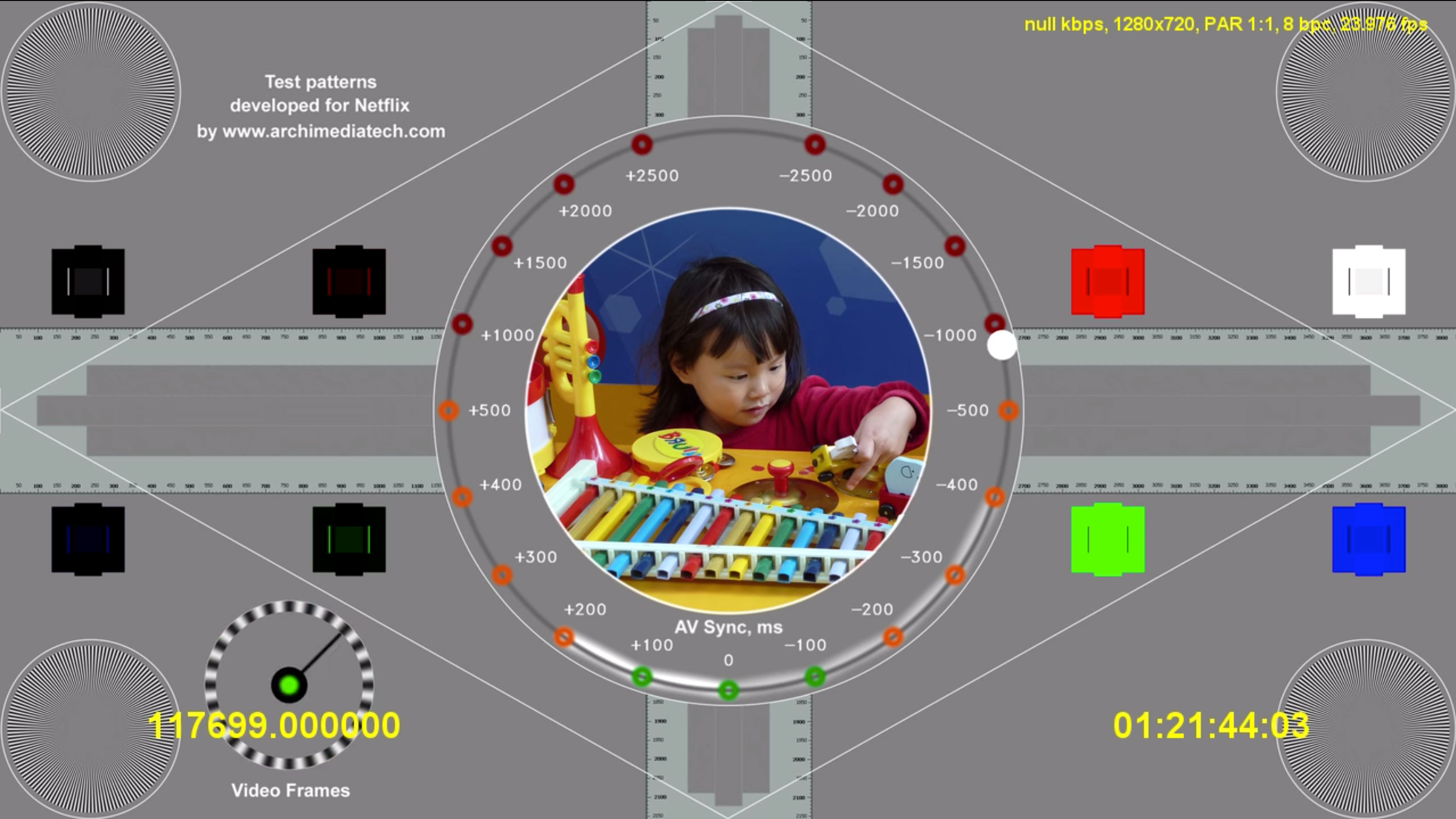
But those color-bar variants from CBS and NBC are nothing compared to what you can find on Netflix. Netflix, despite having no traditional broadcast component, has numerous test signals openly hanging out on its platforms, and they are fascinating.
Netflix has four “seasons” of what is guaranteed to be its most ASMR show, called “Test Patterns.” For the most part, the tests are simple, showing moving images, bright colors, and simple noises. They seem like the kind of thing that we should not be able to find on Netflix, Easter eggs of a sort, but they’re so easy fo find that you don’t even need an account to view them.
These test patterns are far from alone, either. There are numerous examples of tests on the service, including a test for sRGB graphics, tests of different menu styles, and examples of test footage designed for testing motion and high dynamic range.
One of the greatest examples of the test footage on Netflix is an 11-minute “example show”, dating to the early 2010s and starring an actor named “Actor.” An unintentional example of the kind of content Netflix should be making, it’s an endlessly fascinating watch, as the unnamed actor runs through the Netflix headquarters, behind a water fountain, and at one point moonwalks while holding a laptop.
I recently immersed myself in Netflix looking for examples of these, and it was endlessly entertaining. Given the fact that Netflix has literally thousands of hours of stuff to watch, it makes sense that I would choose to look for stuff that they don’t actually intend on you watching.
YouTube itself, side note, is known for unusual tests of its own: It has a test channel called Webdriver Torso which shows very brief animations of blocky images in quick succession. Sometimes, the images feature a silhouette of Rick Astley. It was not known whether Webdriver Torso was a test channel initially. It just showed up on YouTube one day, and people noticed. Eventually, Google confirmed it was a test channel, and if you search for the term on Google, an Easter egg replaces the Google logo.
The color bar design, more complex than it seems, is so utterly pervasive in modern life that we kind of ignore it’s there.
But one person who did not ignore it was David D. Holmes, the late co-creator of the color bars, who died in 2006. After his passing, a letter that he sent family members was emailed to the video production website Video University. And it was obvious to him how much of an impact his color bar generator had made on modern culture.

“Later, when traveling around the world, I saw color bar generators everywhere. There were tens of thousands of them,” Holmes wrote to family members in 2005. “If you see any news room on TV you will likely see color bars on one of the monitors. They show up on the air now and then from BBC in London and others. They are exactly the same as the first one I built fifty-five years ago.”
Which makes it sad that neither Holmes nor Larky received broad notice for this invention that remains in use for video production facilities globally. There are TV shows and movies—lots of them—that have gotten less exposure than the color bars have over the years, and they’ve come and gone. Color bars have certainly changed—they kind of had to, given the fact that our screen sizes changed—but they’ve remained persistent, not just to test image quality, but as an iconic part of television all its own.
You should celebrate this amazing invention by watching them on your screen for a while. You never know. Something might happen.


