The Uber logo on top of the Premier League logos. Just because.
Andy Warhol was right when he probably said that art is everywhere. Look around you, and you see it, telling us a story: from the curvature of our laptops, to the ripples in our coffee cups. And nothing tells more of a story than the 20th century’s highest artform: the logo.
Companies like to change their logos frequently, knowing that their customers love it and there’s never any kind of backlash. In fact they see it as a sort of race – who can have the softest, fuzziest, approachable, blandest company identity? Just this week, the Premier League changed their corporate identity from austere Lion in a Pentagon to a matey web 2.0 start-up with neon colours. A few days earlier, Uber went from an austere Soviet-looking capital U to the sort of thing the Science Museum might have put on a flyer in the 90s. In the past month, BBC Three, failing internet search engine Bing, and even The California Avocado Commission, have also changed their logos. It’s cool to be different.
Videos by VICE
The thing is: football, Uber, telly, avocados – people love those things. They don’t really need a rebrand. They’re doing the job pretty well. We can think of a bunch of organisations who really could do with a rebrand. So we got illustrator and genius Dan Evans to work on some improved versions of Britain’s least popular organisations and businesses.
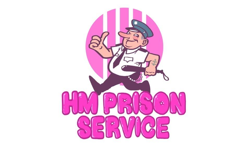
HMP Prison Service
Eugh prison, bit of a downer really. All those cold grey cells and metal bars. It’s not the 80s any more, guys! This old logo looks like it was made on the first ever computer. It’s not very welcoming, is it? Who’s going to want to go there? What prisons need is a mascot, some kind of cheeky Simon the Screw, a rough guard with a hipster edge. Are those the keys to your lifetime of solitude, or a cool chain from Camden Market? Is that anchor tattoo because he’s into emo bands or from the Navy where he killed four people? Where’s that thumb going? The beauty is in the ambiguity.
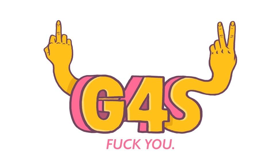
G4s
G4S are one of the biggest companies in the world but no one really knows what they do. Their website says they are the “world’s leading outsourcing group” which basically means they do everything. In recent times, they’ve come under a bit of heat for claims of abuse by LGBT asylum seekers in their UK detention centres and guards abusing teenage prisoners and then falsifying reports about it to avoid fines. In 2013 it was actually nominated for an award for being the worst company of the year and yet in the first half of this year, G4S were awarded £1.4 billion in new contract sales. They need a logo that can reflect that can reflect such success in the face of adversity.

BAE SYSTEMS
and then BAE SystemsFIFA
Britain First
Yeesh. Hard to imagine how these guys could improve their image. That’s probably why large-scale fascism has never taken off in the UK – terrible fonts and an obsession with ugly lions. Nope, don’t think there’s anything we can do here. Wait, hang on, hang on…
Nailed it.
More on VICE:
Sex Shop Owners Around the World Talk About Their Valentine’s Day Best Sellers
Man On Plane Pisses on Fellow Passenger, Sparking Mass Brawl
More
From VICE
-

Screenshot: Nintendo -

Illustration by Reesa.

