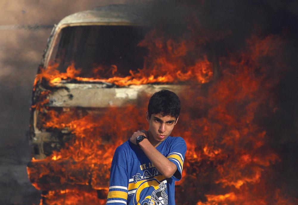
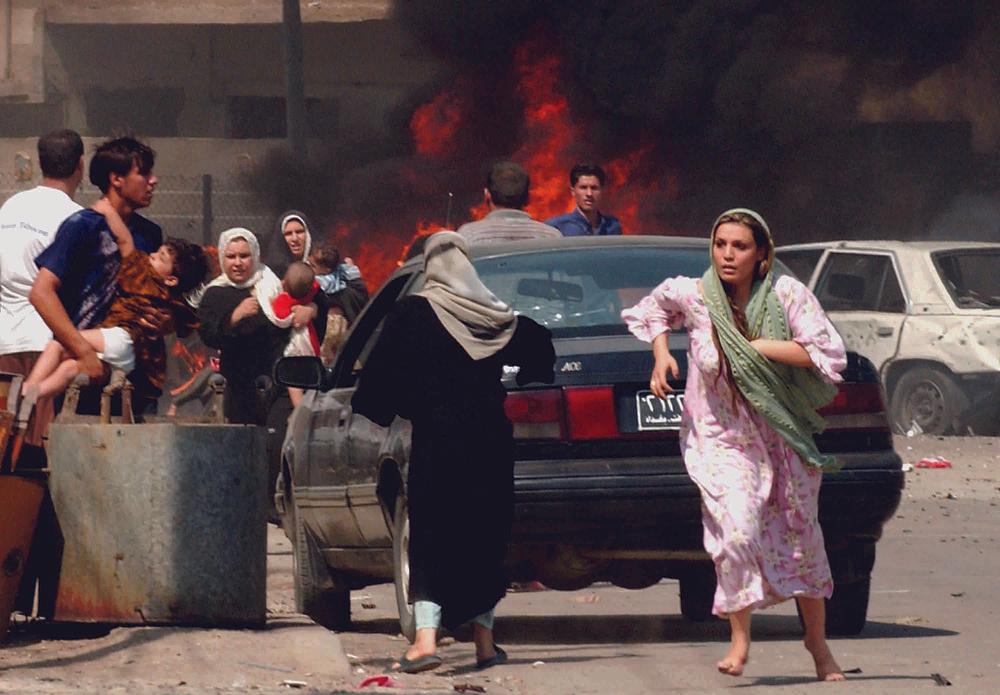
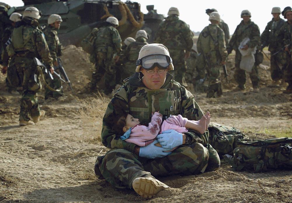
Header image: From ‘War is Beautiful’ by David Shields, published by powerHouse Books. Ozier Muhammad/The New York Times/Redux
On my way to meet David Shields, I kept track of how often I saw a copy of the New York Times. I was to interview Shields in a diner on the Upper East Side and when I arrived I’d seen the color photograph—a scene from Paris in the aftermath of the November 13 bombings—on the front page a total of 12 times. The paper had been in the hallway of my Brooklyn apartment building, in the bodega where I stopped for coffee, in the hands of several people on the train. I passed through several subway stations where, through the train window, I could see kiosks selling the Times amidst gum, soda, Vogue, and other everyday objects.
Videos by VICE
The ever-presence of the Times in my daily life was no surprise and that, in itself, is part of the layered argument Shields makes in his newest book, War Is Beautiful, published by powerHouse Books last month. An apt description of this book comes from one of its many blurbers, Jonathan Lethem, who refers to War Is Beautiful as a “device of inquiry.” One of the many inquiries raised regards the possibility that the ubiquity of the Times and the illusion of its neutrality combine to leave it less scrutinized than other media. If we buy that, then it will be all the more disturbing for us to allow the text’s central claim, that these beautiful, frequently seen war photographs work, without us realizing it, to “glorify war through an unrelenting parade of beautiful images whose function is to sanctify the accompanying descriptions of battle, death, destruction, and displacement,” as Shields writes in his introduction.

The discussion about the ideological effect of the Times‘s curatorial choices is put forth by multiple voices in War Is Beautiful. Dave Hickey’s afterword is as useful as Shields’s introduction. There are 23 blurbs that take up an uncommon amount of space on front and back jacket flaps, some of which acknowledge Shields’s point without conceding it. After reviewing a thousand front-page war images, Shields noticed recurring visual tropes—nature, playground, father, God, pietà, painting, movie, beauty, love, death. Each photograph is presented to us within one of these frames, and each section begins with a carefully chosen quote (from writers like Edmund Burke, Cormac McCarthy, and photojournalist John Hoagland), which frame the frame.
Some of the most important voices in the book’s chorus are in the very back of the book in small print—there Shields lists not just the photo captions run by the Times, but also the original captions authored by the photojournalist themselves or their photo agencies. Alongside an image of a body lying alone in the middle of a muddy red road, the Times ran the caption, “AMBUSH: An Iraqi soldier was killed yesterday by marines who were ambushed in central Iraq.” The original caption chose to highlight the other figure in this image, a US marine facing away from the corpse in the foreground. The original caption begins, “A US marine walked past a dead Iraqi soldier killed in a firefight with US marines early this morning…” It’s here in the descriptions of the images that the greatest sense of unease arises. While the difference between these captions may seem subtle to some, they represent choices about how to report the reality of war. The former caption begins with movie poster sensationalism—AMBUSH!—while the latter evokes a quieter (but deeply grim) moment of soldiers passing and walking away from dead strangers.
This multiplicity of voices causes the book’s overall tone to be, of course, conversational. Shields does not seem to be demanding readers view the photographs just as he views them; rather, Shields is there looking at the images along with you, saying, “Just look at this image. What is this? Why is this on the cover of the Times?”
VICE: Before you canceled your subscription, what was your regular interaction with the New York Times like? Would you have physical copies lying around your house? Would you only see it tucked in with your daily email?
David Shields: I grew up reading the Times. I grew up in California and we always got the Times, which wasn’t the standard thing if you were living in San Francisco in the mid-70s, but we got the paper delivered because both my parents were journalists. So I’ve been an inveterate reader of the New York Times for 40 years. Living in Seattle now, I’d get the hardcopy in those ubiquitous blue bags. From 1991 through the first Gulf War, until I stopped subscribing in 2013 or 2014, I’d get the paper every day at four or five in the morning, and then I’d read the paper with breakfast.

From ‘War Is Beautiful’ by David Shields, published by powerHouse Books. Photo by Mohammed Abed/Agence France-Presse-Getty Images
When did you begin to notice a problematic pattern with the war images on the front page of the New York Times? And how did that noticing turn into a book?
The genesis of the book was in October 1997 when the Times went color on the first page. It seems to me, looking back, that two or three times a week I’d be stunned, riveted, disgusted by these really beautiful images. I’d look forward every morning to what—for lack of a better term—I’d call my war porn: these images of ravishingly beautiful war. I recognized a problem, but I didn’t know where the problem was coming from. I’d start to wonder: Is this just me? Am I over-reading these images? Is it the paper? Is it my relationship to the paper? Initially, I just filed it away under a thought experiment, but over years and years, I continued to notice the same things. Look at this picture.
[Shields shows me a picture on his phone. It’s from November 12, 2015. The picture appeared on page A1 of the New York Times.]
The article is supposed to be about burial, but tell me that it isn’t really about those stunningly, stunningly beautiful women. That was just three days ago. It looks like the cover of Vogue. That’s a curatorial choice. You may not agree with my reading of these images, as some of my students don’t, but can we please talk about the fact that on the front page of the New York Times for an article ostensibly about burial, they’ve chosen this picture, this gallery of incredibly beautiful women. Can we talk about the relationship between atrocity and beauty? That’s the book to me. I would see pictures like this two to three times a week. So I kept on asking myself, Is there a book here? Do I have the nerve to publish a book like this? And then, out of boredom and out of the notion that a writer’s job is to cause trouble for himself and the culture, I started the book. I really do ascribe to this quote of Flaubert’s that “the importance of work can be measured by the harm spoken of it,” or Kafka’s, “A book must be an axe for the frozen sea inside us.” Those are beautiful statements to me. I loved the idea of doing a book that put me in harm’s way and it puts the Times in harm’s way and it puts the reader in harm’s way. And so, for a few years, I worked with some research assistants and we gathered these pictures and we found a thousand, color, combat pictures. Seven hundred of them fit our criteria, and virtually none of them hugely contradicted my thesis. I started putting them into categories. I have such strong memories of meeting my research assistants and looking at these piles of photographs and seeing that we’d have 50 that proved the beauty thesis, 50 pictures of “War as Fashion Shoot,” 50 that were “War as Movie Outtake,” 50 that were “War as Pietà.” I could see that this wasn’t just my hallucination, the evidence was there. Then it was an endless job of curating these images and very carefully choosing quotes and placing them in a particular pattern so that each chapter has its own mini-movement.
So, it was getting the physical paper, getting thrilled and repulsed by the pictures, then having the stupidity to do a book that gathered them. Then I felt that I could no longer subscribe to the Times, either physically or digitally, because I do feel the paper is acting in something close to bad faith in using these pictures. We’d, maybe, expect to see these images in USA Today or the Wall Street Journal, which are overt in propagandizing the war, but these pictures are in the New York Times, the so-called “paper of record.” Which to me is sending problematic messages in their marriage of beauty and violence.

Photo courtesy of the author
I think a lot of people think of themselves as being more media-savvy or image-literate than ever. With the help of The Daily Show and The Colbert Report…
Are people getting their media savvy sense primarily from Stewart and Colbert, you think? Or from wider program of the tradition of Derrida…?
“I kept on asking myself, Is there a book here? Do I have the nerve to publish a book like this? And then, out of boredom and out of the notion that a writer’s job is to cause trouble for himself and the culture, I started the book.”
I think it is structuralism and post-structuralism, post-modernism, Stewart and Colbert, Twitter…
Right, BuzzFeed, Reddit. Twitter. An image comes up, and we are able to sort of “crowd-source” the evaluation of it in our feed. People will point out things like a publication slightly darkening the skin of a perpetrator. We think of ourselves as being able to deconstruct every image and yet the Times remains weirdly above the fray.

From ‘War Is Beautiful’ by David Shields, published by powerHouse Books. Photo by Joao Silva/The New York Times/Redux
Do you think people think are mistaken in thinking that we are living in an increasingly media-savvy or image-literate time? Or is it that the Times is just less scrutinized than other news sources? How does it maintain its position “above the fray”?
It’s proverbially shooting fish in a barrel to take a Sean Hannity clip and show how he’ll say one thing about Bush/Cheney and turn it 180 degrees when talking about Obama/Biden. When things like this are pointed out, it is often well done and useful, but it isn’t exactly revelatory. It’s helpful to point out the idiocies and hypocrisy and propagandizing of Fox News, but any person of any education with any slightly progressive bent will say, “Yeah, yeah, yeah, I knew that.” But I think the Times, without pretending to be any sort of left-wing paper, is understood to be, at worst, centrist, and at best, slightly center-left. They’ll endorse a Democratic candidate always for president, but they are essentially a centrist paper. If this had been a Murdock-owned paper, there’d be less of a point to make, but the Times is thought to be the “imperial arbiter,” the “impartial umpire,” the “paper of record,” “all the news that’s fit to print,” “the first draft of history,” etc. So it really matters what they’re running on the front page.
For example, it’s amazing that papers agree not to show coffins coming back from the war. That’s a huge propaganda win.
The book is meant to say, “Can we please worry more about these pictures?” Look again at that picture from November 12, 2015. Can we not agree that it’s an editorial choice that is marrying the beautiful and the traumatic in ways that are doing cultural work? These images are disseminating ideology in complicated ways that I can’t totally tease out. But it is there and it’s not talked about enough. Why this picture? Presumably, you have many pictures to choose from of this burial site and you run this picture? It’s amazing to me. It’s absurd.

From ‘War Is Beautiful’ by David Shields, published by powerHouse Books. Photo by Wathiq Khuzaie/Getty Images
In Dave Hickey’s afterword, and in discussions you’ve had elsewhere about this book, there’s attention called to the ways in which the image is squared in all these specific ways, the lining up of subjects in the vertical middle, the diagonals—there’s a perfect diagonal in this November 12 picture. There’s a diagonal lining up of the subjects in the vertical middle. It makes for a very studied composition.
And those shovel handles are amazing the way they line up. It is very painterly. I think that Hickey does an awfully good job of pointing this out with the images in the book.
It adds to the book’s ever-building argument that these images are imitating great artworks of the past few decades and are, therefore, not trying to capture the reality unfolding in front of the camera. As I read your book, I kept wanting to maintain a distinction between “beauty” and what we might call “aestheticizing,” where “aestheticizing” could potentially do critical work or help a viewer see—through the lens of thoughtful, purposeful art—the war in a more serious and real way.
I know what you mean, like Guernica or something…

From ‘War Is Beautiful’ by David Shields, published by powerHouse Books. Photo by Chris Ison/Press Association
Do you think that art could usefully frame war in some productive or useful way? Or will any attempt at artfulness take away from the horror of war? Is there some middle ground?
How would you define “aestheticizing”? A very casual definition? Making that definition could be a whole seminar.
“The point-blank execution of the Vietnamese man and the naked girl running from napalm? Those pictures, to me, have a raw and naked reality. The pictures now always seem to err on the side of sorrowful, dignified, noble.”
Yes, right. For starters, “aestheticizing” would have to do more than merely sanctify. In your introduction, you talk about beauty as sanctifying force.
Yes, and dignifying. That’s an important term to me. The idea that horror, suffering, sorrow could, through these images, appear ennobling, dignifying, and therefore worthwhile. Again, the November 12 picture makes human sorrow seem dignified and it makes war seem noble. That’s the cultural work that beauty is doing here. I’d just like the Times to acknowledge that. Either the Times is being terribly naïve and is just moving product or—and this is the more insidious and paranoid reading—they know exactly what they are doing and are, in a way, working hand-in-hand with the US government to promote global warfare. I mean, the truth is somewhere in between those two. I sort of lean more toward the former. The decline of print journalism, the ubiquity of the web—they’re doing anything to have people pay attention. They are going to run Vogue-level model beauty on the cover. They’ll be damned if they’re going to turn down that picture.
I think this book definitely exists in a strong relationship to Reality Hunger. Some people thought I was arguing for the abandonment of art or something like that, but that’s not what I want. I want an art that’s congruent with the 21st century, art that is working harder to capture contemporary reality and isn’t just retreating to tired conventions. In the same way, I argue that these images are retreating to tired pictorial and visual tropes. Hickey does a great job of showing how picture after picture is a footnote to—an almost clear quotation of—Andy Warhol, Jasper Johns, Robert Rauschenberg, Diebenkorn, Rothko, Pollock. Gerhardt Richter is in five of these images. These pictures are aspiring toward the crystalline beauty of glorious art. I mean, Richter is a great, great painter, but his work is framed as art. I feel that what these pictures never do is work hard to faithfully document observed reality. It would be nice if sometimes the horror show got conveyed. I think some of the images and video that came out of the Paris bombing, especially on BBC, conveyed some of the swirling chaos and incipient horror of the moment.

From ‘War Is Beautiful’ by David Shields, published by powerHouse Books. Photo by Damir Sagolj/Reuters
I’m curious how this problem of representing the war gets resolved. On one hand you’ve got this beauty problem. If the images representing war are aiming, as your introduction and Dickey’s afterword argue, at beauty, and if beauty works on the viewer as a sanitizing, ameliorating, and—most problematically—distancing force, then what we end up with is a tacit glamorization or ennobling of war. On the other extreme, we could call for the only photographs that are chosen to document the reality of war as faithfully and, potentially, as brutally as one could. But there has to be a middle ground. What do you think a middle ground looks like?
People have said to me something like, “Well, what does Shields want the photographers to do? Does he want the pictures to be aggressively banal and not beautiful?” It’s not like I’d urge the photographers to turn in blurry photographs of bloody thumbs torn off, but these current pictures to me, to my understanding, err so far on the side of rapture, of swooning beauty, that there’s precious little of the horror of war. These are highly sanitized images of war, and so can we at least acknowledge that? This feels like a PG war. It’s a Disney war. Let’s talk about that.
In the Times during Vietnam you’ve got Eddie Adams and Nick Ut publishing Pulitzer-Prize winning, culture-changing photographs. The point-blank execution of the Vietnamese man and the naked girl running from napalm? Those pictures, to me, have a raw and naked reality. They’re incredibly beautiful and artful photographs, but those pictures find a useful and productive middle ground that I would argue for. I don’t see those pictures in the Times anymore. The pictures now always seem to err on the side of sorrowful, dignified, noble.
I think it is impossible to underestimate the value to the military and the government of embedding journalists and photojournalists within a battalion. The result to me is censoring and self-censoring. If those pictures are uploaded instantly to the whole world, including the very soldiers you’re in a foxhole with, then it seems to me increasingly unlikely that the photographer is going to disseminate pictures that are anything other than dignifying the very sacrifices that the soldiers he’s living with are participating in. I think there are so many factors that push The New York Times further and further away from what seems to me a more admirable tradition of combat photography—the embedding of photojournalists, the Times overcorrection of their underreporting of the Holocaust, the decline of print journalism, the rise of the web, the huge push of right-wing propaganda think tanks pushing all media toward the center and the right. The Times is trying to survive, but at what cost?
Many of us would not want to lose this belief that art can do important political work.
I don’t want to lose that belief.
But I think that this book does challenge that belief at its core. Part of the argument the book makes is that useful cultural work is difficult and all-too rare. Beauty alone does not accomplish it. In fact, it could accomplish the exact opposite—it can take us further and further from reality through its distancing force. So, maybe we can come away from this book and say, yes, it’s still possible for art to bring us closer to reality, but when it happens, it is hard-earned and it has to be much more thoughtful and intentional than just making a beautiful photograph.
I think you’re right. And I know what you mean. It seems these pictures are happy to be naively beautiful. War as abstracted beauty is a problem. But I like the way you and I are now struggling toward a useful middle ground. Not that every image is going to be a bloody corpse with exposed viscera. That’s not going to happen. But—and these are, of course, subjective terms—a useful, well-considered, hard-earned, intentional beauty. That seems like a ground worth fighting for.
Chloé Cooper Jones is a writer and philosopher who studies and teaches in New York City. Follow her on Twitter.
War Is Beautiful: The New York Times Pictorial Guide to the Glamour of Armed Conflict is available in bookstores and online from powerHouse Books.


