Last week, the General Services Administration—historically known more for maintaining government buildings and procuring fleet vehicles than for developing typefaces—rolled out “U.S. Web Design System 2.0,” a new iteration of its design framework for government websites. It’s been four years since the USWDS project began and two years since their 1.0 release; nearly 200 government websites are now utilizing it, including sites for big government agencies like the Department of Homeland Security, Customs and Border Patrol, and the Department of Labor.
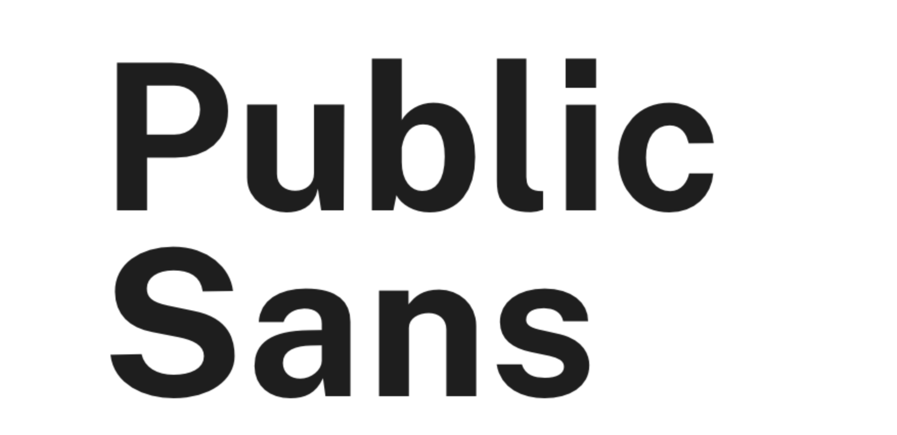
The new 2.0 version of USWDS includes a host of updates based on the last two years of designer feedback, as outlined in the team’s blog post about the new release. While most of the changes won’t be terribly interesting to anyone who doesn’t build websites for a living, one big change caught our eye: the federal government has created its own bespoke typeface for the project, fittingly named Public Sans.
Videos by VICE
Prior to this release, USWDS made use of a handful of open source typefaces developed out-of-house, including the ever popular Source Sans Pro, and Google’s Roboto. Public Sans marks the team’s first foray into developing a typeface of their own, and at first glance, they appear to have done a pretty good job of it.

Rather than trying to reinvent the wheel in a world that’s already full of perfectly acceptable web-friendly typefaces, the USWDS team have lightly modified an existing sans serif staple. Public Sans is based on Libre Franklin, a modern open source version of the century-plus-old Franklin Gothic.
“The Public Sans typeface was initially created to remove the rounded terminals from the Libre Franklin typeface, to make it closer in tone to the classic Franklins from which it drew inspiration,” a GSA spokesperson told Motherboard in an email. This choice lends the new typeface a sharper, more institutional look than Libre Franklin, which suits its purpose as a typeface for government websites quite well.
While the team seemed reticent to speak on why exactly a department of the federal government decided to make its own typeface, rather than continuing to make use of the open source materials it’s already been using, the broad strokes answer seems to lie in a new feature that’s been introduced with the release of USWDS 2.0: support for custom typefaces.

“[During] the U.S. Web Design System 2.0 development process, it became clear that this typeface could be a useful target for our font normalization feature,” the GSA spokesperson explained. “Since other faces are normalized to the optical size of Public Sans and common system fonts in USWDS 2.0, using Public Sans in our design files ensures that when designs go into production the balance of the type hierarchy remains similar, even if the chosen font eventually changes.”
In other words, Public Sans is somewhat of an internal test case for USWDS 2.0’s ability to adapt whatever typeface a designer may wish to use into the visual language of the rest of the USWDS framework. Of course, the team also foresees Public Sans being quite useful to designers with no intention of replacing it with custom fonts, describing it in its aforementioned blog post as a typeface that’s “simple, neutral, and isn’t Helvetica.”
Fortunately, the GSA is releasing Public Sans under the SIL Open Font License, so designers working on projects outside of the federal government will be able to freely utilize the new typeface. Thanks to its clean, crispy style and its generous assortment of line weights (nine in total, from a razor-thin 100-weight up to a super-bold 900 weight), Public Sans should prove a welcome addition to the typeface collections of interface designers everywhere.


