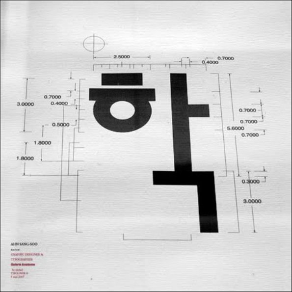
Each week we pay homage to a select “Original Creator”—an iconic artist from days gone by whose work influences and informs today’s creators. These are artists who were innovative and revolutionary in their fields. Bold visionaries and radicals, groundbreaking frontiersmen and women who inspired and informed culture as we know it today. This week: Sang-Soo Ahn.
Simply put, Sang-Soo Ahn (1952- ) is the godfather of Korean typography. His inimitable legacy imprinted on the scriptural revolution of Hangul, the Korean alphabet, places him at the forefront of East Asian design and beyond. Much more than a typographer and graphic designer, he is a multi-faceted cultural producer who transmits his poignant philosophy through various mediums from visual design to poetry, photography, and installation. With about 40 years of innovative contributions under his pen, this designer has reinvented and championed the field of linguistic illustration.
Videos by VICE
Generally understood as the simplest writing system in the world, Hangul, so linguists say, can be learned within just a few hours. Comprising 14 consonants and 10 vowels, this practical linguistic system is founded on five basic elements: vertical, horizontal, and diagonal strokes, the dot, and the circle. Established by order of King Sejong in the mid-15th Century in a progressive effort to create an alphabet unique to the spoken idiom and, in doing so, break away from its foundation in Chinese ideograph, Hangul symbolically realizes Korea’s cultural independence.
The iron Hangul Gate at the artist’s home.

Blossom Hangul featuring the ‘ㅎ’ (hiut) consonant.
Sang-Soo Ahn fosters and transmits the history of his native language through unparalleled idiosyncrasy. He was the first to “step out of the box,” so to speak, exploiting the graphic flexibility of Hangul and removing it from its incommodious square-framed structure. His unconventional pursuits are reminiscent of Jan Tschichold, as the German typographer’s 1928 manifesto, Die Neue Typographie (The New Typography), was a prominent influence and essential gateway to European design and theory for Ahn.

Welcome Ahn Sangsoo
After graduating from Seoul’s most prominent art institution, Hongik University, Ahn began his career as an advertising designer in public relations for what is now LG Electronics, but ultimately chose to shake off his corporate constraints. Very soon the young designer began to cement his footsteps in the creative community by working as an art editor for Ggumim magazine in 1981, then becoming the art director for magazines Ma-dang and Meot by 1983. It was during this time he began examining the readability of the Korean typeface in newspapers, for which he was awarded a Korea Newspaper Award.

This eventually led to the designer’s first self-titled typeface configuration in 1985, the same year he founded Ahn Graphics, a design firm and publishing house. As today’s representative Korean font, the Ahn Sang-Soo typeface marks the first Hangul type that accords attention to variable width. At present, Ahn totals four major fonts in Hangul.

I-Sang font named after his favorite Dadaist poet, I-Sang.

alpha.to.hiut
From opening the first internet cafe in the country to his four thousand plus collection of one.eye photographs to being vice president of ICOGRADA from 1997-2001, the designer is, to say the least, one of the most active Korean creatives in the global community. The clout of Ahn’s contributions to Korean typography has granted him a plethora of awards including Designer of the Year from Design Magazine from as early as 1983, recipient of the GRAND PRIX from ZGRAF 8 in 1998, and the 2007 Gutenberg Prize. He continues to educate young designers at his alma mater, Hongik University, as a professor of typography. In addition, Ahn disseminates his radical innovations through the publication of his alternative art and culture magazine bogoseo/bogoseo or report/report, which he started in 1988.

once.upon.a.time.,words.were.stars..
when.they.took.on.meaning.,they.fell.to.earth.
What is incredibly unique throughout his graphic repertoire is his ability to draw out and emphasize the elementary, as can be seen above in this experimental examination of the ‘ㅇ’ (iung) character. Succinct and bold in meaning and appearance, the achievement embedded in the few words of the title exemplify the basic philosophy of the designer. With the punctuation of each period organizing his artistic intention and resonating the staccato rhythm when read, this onomatopoeic phrase subsumes the thoughtfulness subtly inherent in his designs, wherein function becomes practical as much as it is aesthetic.