Last week, a photo of a rainbow-colored rock in San Francisco went viral. To the casual passerby, the stone displayed in the alcove of a business was a symbol of inclusivity, likely pegged to Pride month. But to the trained observer—in this case, as SFGate reported, the Coalition on Homelessness Twitter account—it represented a particularly odious form of “anti-homeless” hostile architecture.
What, exactly, is hostile architecture? Whether you’ve used the term or not, I assure you that you’ve seen it, possibly even today. In fact, once you tune into the rhythm of this insidious design practice, it’s hard not to see it everywhere.
Videos by VICE

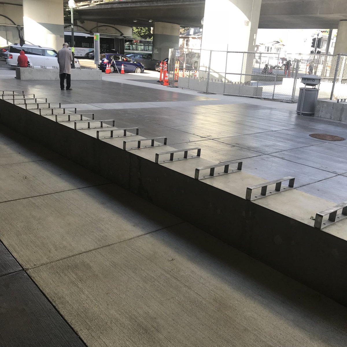
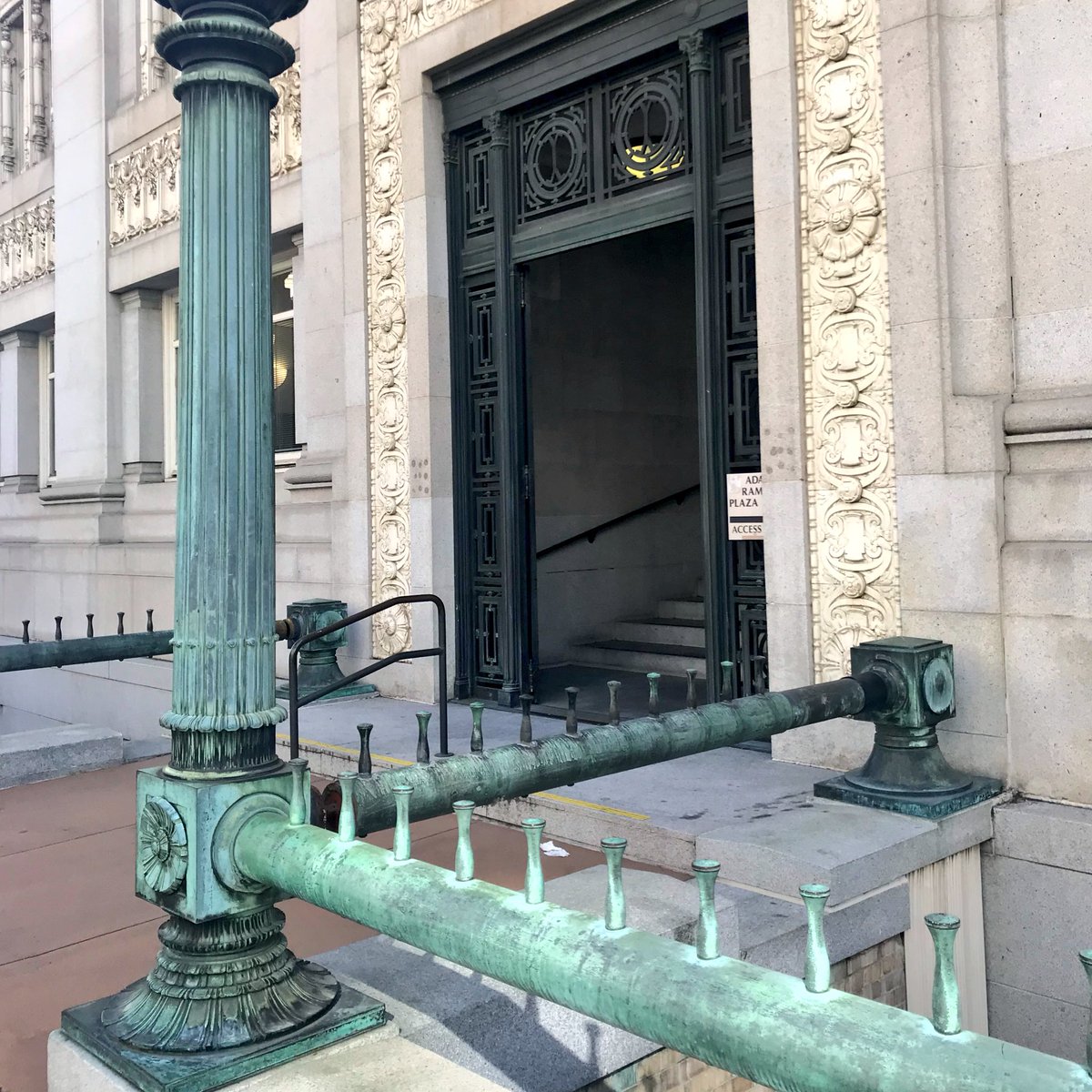
Those tiny spikes on roofs keeping pigeons from hunkering down and pooping on everyone? They’re in the family, but they’re for birds, so who really cares? But the pegs on handrails or the corners of cement benches that keep skateboarders from grinding away? Absolutely hostile. And those obscenely sloped bus benches that allow people to only kind of lean against but not sit or, God forbid, lie down? Definitely.
At its core, hostile or “defensive” architecture amounts to a forever campaign waged, consciously or otherwise, by designers, landlords, and developers to force people to use property in exactly one way. Sometimes, the end result isn’t exactly a tragedy; skaters might have to go somewhere else, for instance. But in its most malignant form, hostile architecture can deter homeless folks from resting. In those cases, public or quasi-public spaces of cities—often defined by unequal access to transit, groceries, and other essentials—become a visceral extension of society’s collective disregard for their fate.

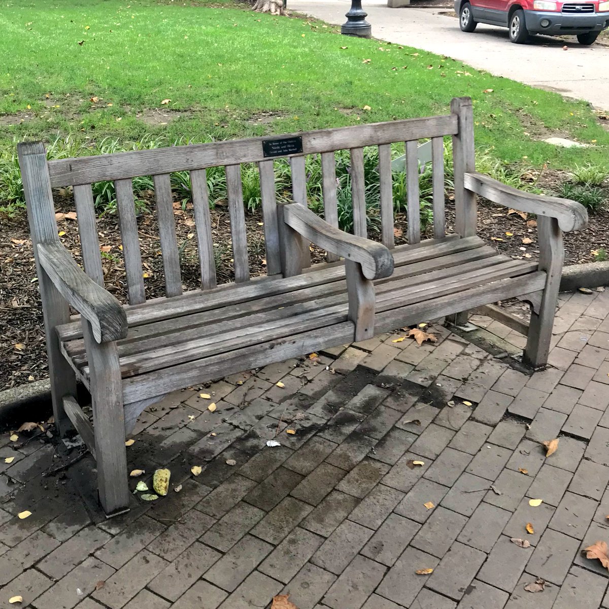
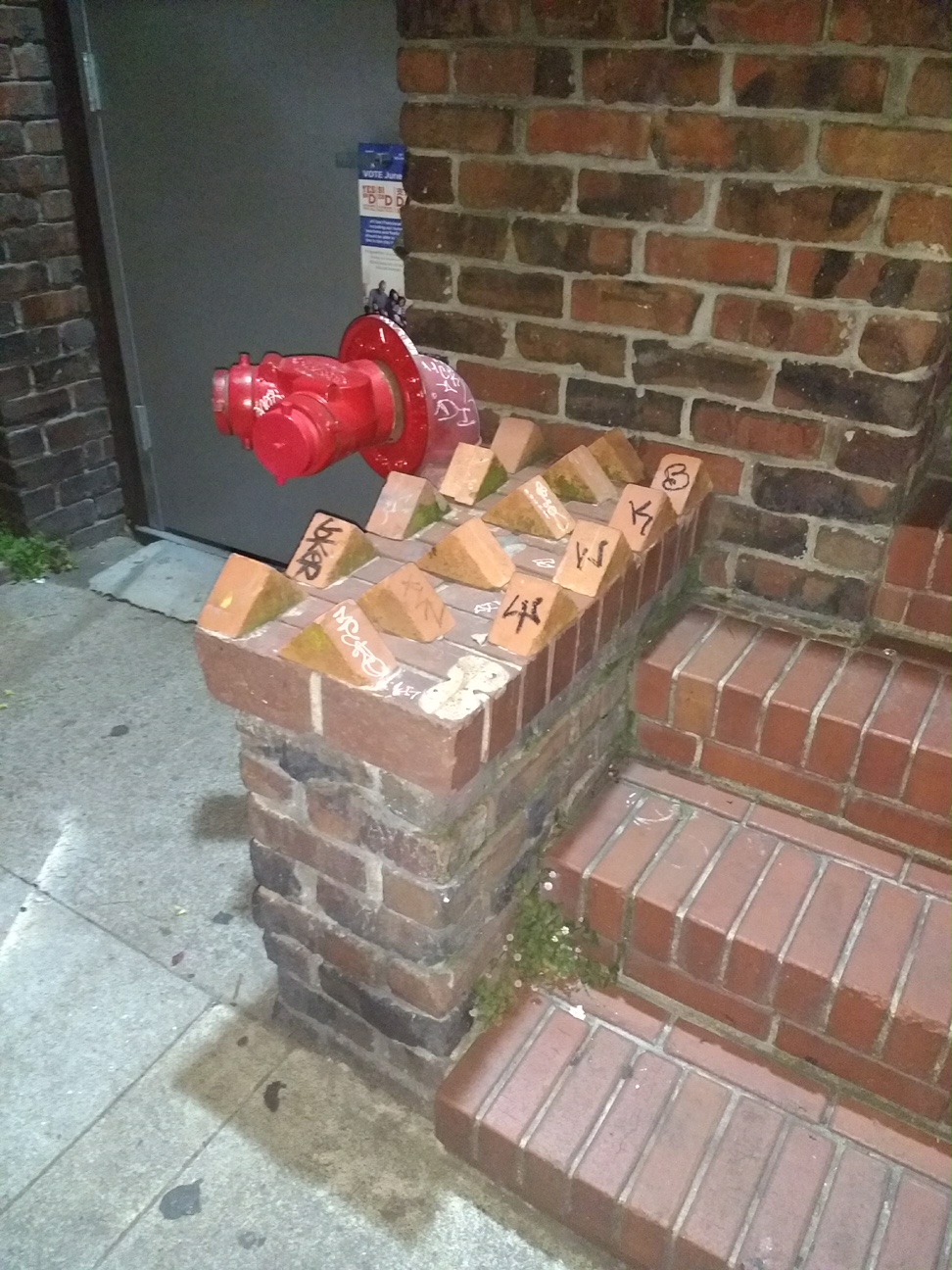
Hostile architecture can consist of bars in the middle of benches, small fences in business alcoves, or spikes cemented in chunks of sidewalk that seem random until you notice that the spot in question is protected from rain or the blistering sun. There are even audio versions of what seems an awful lot like hostile architecture: In downtown Oakland, a newsstand blasts orchestral music 24/7 from speakers outside. If nothing else, such a spot is not exactly inviting to those in search of sleep.
Previously, when asked about their strategy for managing public spaces, a spokesperson for the California Department of Transportation (DOT)—which had placed boulders where folks once camped in the Bay Area—said they “use fencing and landscaping elements to prevent and discourage…. illegal encampments.” It’s worth noting that many people sleeping outdoors within U.S. city limits are doing so illegally, although due to the 2018 Martin v. Boise court decision, they might not be punished for doing so on public property unless the city in question provides adequate indoor space. It’s still unclear what this decision will mean to the estimated 550,000 homeless people in the country, nor the growing population in the Bay Area, which has massively increased over the past two years.
Back to that Pride-painted rock in San Francisco that caused the Twitter ruckus.
As “hostile architecture” posts have in the past, the story blew up for a few days on social media—until the Coalition deleted their original, having determined the restaurant was “a valued member” of the community and “supportive of its homeless neighbors.” That may be true, as the business explicitly denied anti-homeless intent, pointing to the rock as part of a Japanese garden. And this isn’t the place for a debate about whether or not businesses are in the right or wrong even if they do choose to shoo homeless people away. Because when it comes to hostile architecture, it’s more important to realize the effects than the intent, whether aesthetic or otherwise. And you can’t do that without knowing what it looks like.
Here are a few other examples of what might be classified as hostile architecture. Do they seem hostile to you?


Sign up for our newsletter to get the best of VICE delivered to your inbox daily.
Follow Rick Paulas on Twitter.


