“I can’t tell you how many parties I went to in the 90s where I was at some random apartment where people were doing molly and bad cocaine, and they would have that poster,” said T. Cole Rachel, senior editor at the Creative Independent. “That poster” was for the movie Trainspotting, Danny Boyle’s 1996 opus about a group of heroin addicts scheming and shooting their way through Scotland. The film’s grisly depiction of drug use and existential ramblings would come to define a generation of disaffected youth. It spawned countless parodies, late-night meaning-of-life conversations, and inevitable political rants from people about how the film was glamorizing heroin (apparently their definition of glamour included Ewan McGregor sticking his face into the world’s worst toilet in search of opium suppositories).
Though the movie would go on to become a major hit, the poster campaign was groundbreaking in its own right. Its distinctive look—which was recently reinterpreted for the film’s sequel, T2: Trainspotting, helped cement the film’s cult status. But perhaps more important, it didn’t resemble anything else in the industry at the time—and that was the point.
Videos by VICE
“The film distributors were looking for something that kind of set it within a similar market to the music industry,” said Rob O’Connor, owner of Stylorouge, the firm that designed the original Trainspotting campaign. “We didn’t really want it to look like any other film poster.”
Adds Mark Blamire, who worked at Stylorouge at the time, “We were given lots of time to develop and nurture the ideas that went into the campaign and come up with something unique. I think that film companies rarely go to proper design agencies. They just want to market the film, so they use the same old clichéd format.”
Stylorouge, which was then best known for its album cover work with the band Blur, succeeded with Trainspotting by going anti-cliché. It used a bright orange color palette and Helvetica typography to resemble the warning signs you might see on hazardous materials or a bottle of prescription drugs, then shot black-and-white portraits of the actors—a major creative risk for a film that wasn’t actually in black and white to begin with. But the initial test shots ended up being a bit… off; the cast looked too chummy, like they were part of a cheesy network sitcom and not a film about heroin. So they were shot in character instead.
“These guys just walked in very intense,” said O’Connor, about the day of the photo session. By then, the cast had just wrapped shooting and was exhausted. “They really had been living this life for a few weeks. And it was a reasonably low-budget movie. They weren’t being mollycoddled as actors. They looked pretty grim.”
Grim, perhaps, but they were still game to do what was needed—even McGregor, who had to be soaked in water for the shoot, a callback to the infamous toilet swimming scene. Once O’Connor, Blamire, and photographer Lorenzo Agius completed the necessary shots, the design was shipped off, and posters soon began popping up near universities to help drum up excitement among students. Considering the initial fanfare surrounding the film—the movie was based on a popular Irvine Welsh novel of the same name and had previously been turned into a play in London—it wasn’t long before other companies were parodying the work that Stylorouge had come up with.
“It became a bit of a standing joke,” said O’Connor. “For a long time, I did actually collect all the pastiches I saw, but it eventually became too many.”

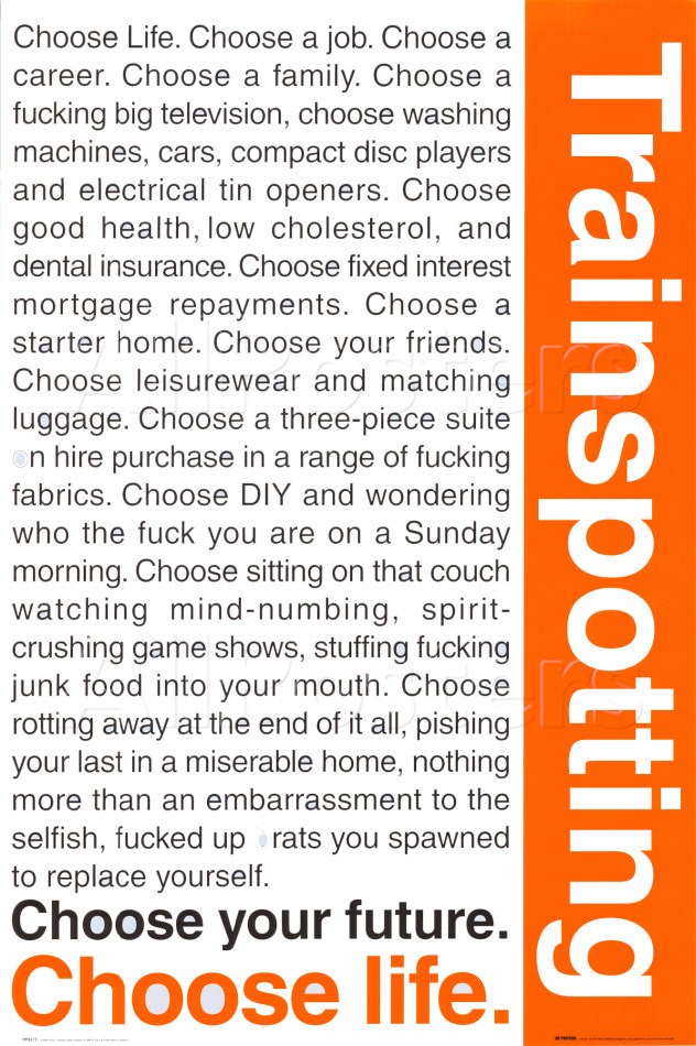
Trainspotting monologue poster
One poster Stylorouge wasn’t involved in was the one that featured McGregor’s famous “choose life” monologue. For years, I had associated that particular poster as the “official” version from the film, having missed out on the character poster work. I had seen the monologue version countless times, pinned up in dorm rooms and apartments. I even remember the first moment I spotted it, freshman year in August 2004, during the annual campus poster sale. So who designed this poster? Was it some mass-produced bootleg? Not quite. After Stylorouge created the original poster, the producers ended up licensing the campaign to another agency.
“It was a very early license for us. Most of the designs were taken from the [original] campaign,” said Mark Arguile, a senior licensing manager at GB Posters, the company behind the monologue poster. “We kept renewing it over the years. It has never been out of print. Most of the designs were taken from the campaign they did themselves. We did three versions of the quotes poster. It’s probably the only poster license that we’ve had continuously for 20 years.”
It may not include any of the actual actors on the list, but the monologue poster does feature the film’s most important, heartfelt bit of dialogue: the one that made Trainspotting more than just a movie about drugs. The “choose life” speech epitomized college student ennui and the crippling anxiety young adults feel as they get older and try to find their place in the world.
“I still have it,” music journalist and Trainspotting super fan Kat Bein told me. Bein, who first saw Trainspotting when she was 14, has been carrying around that same poster ever since. “You like [the movie] because it’s filled with bad stuff, and it’s cool and edgy, and you’re a fucking 14-year-old and what do you know? But as I’ve gotten older, that monologue has really resonated with me… There’s this point when you get to your life where you need to make choices.”
Follow Alex Suskind on Twitter.


